ShopDreamUp AI ArtDreamUp
Deviation Actions


Suggested Deviants


Suggested Collections


You Might Like…


Featured in Groups


Description
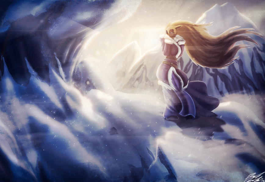
"Solace Everlost"
-
Where is it?
...
My direction. I seem to have lost it. Somewhere between the bitter memories, and the ignorant bliss that separated us. Oh those days of youth, golden dew from the mountains of expectations, watering fertile soils of promises.
I remember my ambition well. Vigor inflaming every ounce of my being. I had wings those days. Wings that could touch every horizon...
And of course, I flew towards the one place I was warned against...
I wonder how long it's been. Is my bed still warm as it was before? Does father still wander the gardens at dawn? Perhaps they cry when they discover the leftovers of every meal.....
Why did I do this? What was so important to travel this path? What was it's purpose? And am I even closer, or further away from it? Where is it?
...
Where is my direction?
---
---
---
A personal work that I did in response to how stagnant and lost I've felt over the past year, similar to the venting that backed my submission titled "14." This is Mika in a moment of contemplation. Her storyline, at the beginning, is a bit of a sad tale, until she meets Stryder anyway. More details on that later
Special thanks to for rubbing his magic pixy dust (AKA dandruff) all over this. Enjoy!
Here's the original; [link]
-
Where is it?
...
My direction. I seem to have lost it. Somewhere between the bitter memories, and the ignorant bliss that separated us. Oh those days of youth, golden dew from the mountains of expectations, watering fertile soils of promises.
I remember my ambition well. Vigor inflaming every ounce of my being. I had wings those days. Wings that could touch every horizon...
And of course, I flew towards the one place I was warned against...
I wonder how long it's been. Is my bed still warm as it was before? Does father still wander the gardens at dawn? Perhaps they cry when they discover the leftovers of every meal.....
Why did I do this? What was so important to travel this path? What was it's purpose? And am I even closer, or further away from it? Where is it?
...
Where is my direction?
---
---
---
A personal work that I did in response to how stagnant and lost I've felt over the past year, similar to the venting that backed my submission titled "14." This is Mika in a moment of contemplation. Her storyline, at the beginning, is a bit of a sad tale, until she meets Stryder anyway. More details on that later
Special thanks to
for rubbing his magic pixy dust (AKA dandruff) all over this. Enjoy! Here's the original; [link]
Image size
869x597px 727.59 KB
© 2012 - 2024 Toughset
Comments6
Join the community to add your comment. Already a deviant? Log In
I'll critique this piece and later (see "comparison" section) critique the differences between this and the original.
***
LINES: Not really any definitive lineart in this but that's the beauty of this piece. Instead of having lineart define the shapes, it's lighting and shading, and it sure looks gorgeous. Very lovely to look at.
COLORING/SHADING: Beautiful coloring and shading. It feels emphasized even more due to the lack of definite lines. Wonderful use of blues and grays in the snow and ice. Nice deep shadows in the crevices and the clothing, excellent color palette used, especially with the sky and lighting. Beautifully done.
COMPOSITION: I like the composition in this version better than the original. It brings more focus to the character and allows us to engage a bit more. On the other side (for the sake of argument), the large ice formation on the left side of the canvas looks far more menacing, monstrous, and overpowering in the original. The cropping in this version brings both of them to more even ground. However, I still conclude that this version has enough of it visible to still bring an impact and good framing device.
CHARACTERS/ANATOMY: The character is well-placed and shows a decent expression that fits the overarching theme of the piece. Good work on the clothing, nice design and color choice. Good feel of movement with the lines of the hair and clothing. She seems unnaturally thin but mainly, her balance seems a little off. Although that could be suggestive of a strong wind, it would make more sense for her to be bracing against it. However, it is difficult to tell where her balance is because of her anatomy and clothing. Also, her feet seem disconnected from the ground, giving an effect as if she's floating. Overall, not bad at all.
BACKGROUND: Nicely laid out and beautifully executed with lighting. Not much else to say since most of it was said in the color section.
EFFECTS: The overlay of effects by *DanSyron adds some nice sharpness to the snow and shadows and really brings out the cool purples on Mika. Very nicely executed.
IN COMPARISON OF OTHERS WORKS BY THE ARTIST: The use of shading and tones for the separation of the elements (vs. lines) is absolutely beautiful in this piece. Very strong work in comparison to other pieces in the gallery.
IN COMPARISON WITH ORIGINAL PIECE: Both versions have their own strengths and weaknesses. The lack of the flare effect in this version is a plus and the lighting, although lovely, offered a bit more detail in the original version. Mika's feet do not seem as disconnected from the ground and her clothing looks softer in the original. In the end though, I conclude that this version looks better due to the sharper colors and deeper shadows. The cropping adds as well.
POSSIBLE MEANS OF IMPROVEMENT: I still question the balance on Mika. It still may just be her clothing but you may want to double-check. Her shadow could be a little longer as well but that's a minor issue.
OVERALL IMPACT: Very strong piece, nice color palette, excellent differentiation in shadows and elements, lovely work.
Respectfully,
Hawkeye